Showing posts with label stupid designers. Show all posts

Thursday, April 26, 2012

Another Look at Nike's (not Purdue's) New Train

If you break down the old motion train, from a visual standpoint, there's room for revision. The perspective doesn't line up well, and there are some issues in the mark that make it kind of tough to love.  But, I've always, at least, liked it.

I've worked on the licensing side of the business with Purdue...and understand a bit of what Nike's problem with the old train was. It's not a balanced shape, so it's tough to center on hats and shirts and its sharp tail makes it hard to fit onto sleeves and things of that nature. So, I get why Nike would want a revised logo.  I also understand that if the athletic department has to pay $0 for a revised logo, they'll probably jump at that.

But, the new train that Nike is forcing upon Purdue fans leaves a lot to be desired. It's designed kind of lazy in that it's not only balanced, but completely symmetrical (the smoke specifically).  But, much worse, the smoke seems to form a very veiny phallic shape...which is nothing but negative, from my perspective...and if it's not a joke being played on Purdue, it's laziness, once again, that let it by.

I'm a person that hates criticism without a solution being offered...so simply, here is my quick solution- Change the smoke and add the motion P to the front, and I think Nike might have a winner.  As of this morning, in the BTN poll, over 80% of the fans who looked at the new mark disapproved of it...
Here's my solution:

Thoughts?

Thursday, April 07, 2011

Ugh...New Pete revealed (then hidden)

The new Pete was revealed via a half-assed grainy video on Thursday. But after significant push-back via the interwebnet, the revised, and newly-neutered Pete images and corresponding video had vanished. Well, in case you missed it, here you go (thanks cminat02, via Twitter):


Tuesday, December 14, 2010

You Can Do Better? Prove it. Big Ten logo contest.

Thanks to Mackey West, a loyal BSer, we're hosting another contest. And, since I'm in charge of it, you'll actually see something come of it (oooh, burn, J Money).

Pretty Simple.

There will be two categories:

1) Name the Divisions.
Pretty simple. It's your turn to name the new league divisions. You can be funny or serious...whatever you think will get you in our good graces.

2) Design the logo.
All of you graphic designers or those wish they were will get a chance here.

Rules are simple- We'll only take one entry e-mail into consideration. Within that message, you can have three of each category, max. The Deadline is 1/1/11. The winner will win a prize of our choosing.

Good luck. (the e-mail address is on the right side of the page)


Thursday, October 14, 2010

Nearly $200,000...for what???

Really? Really?

There are some good marketing people out there- those who can strike a chord with a consumer or potential consumer...the sharpest of the sharp will make you feel emotionally-involved with a simple word and the images that correspond with that word.

Purdue didn't hire those people when it decided to re-brand the university...But the really bad news is they paid a pretty good amount of money for a really brad tagline and re-built image.

See here for yourself, if you'd like...but we'll tell you all you need to know:

"We are Purdue. Makers all."

Holy-stinkin' Moly!! That is awful. Remember, they also promised us the colors would change and there would be corresponding icons- can't wait to see what this braintrust came up with.

I'll say this- if the people responsible for this junk are alums, they should be ashamed. Plain and simple. If they're not, we should check if they're not IU or UND alums...because this sounds like sabotage, to me.

I generally don't like marketing people, because I feel most are simply talking out of their arses...this doesn't help.

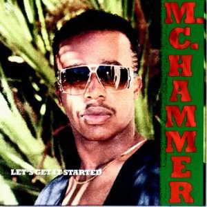
I presume Ms. Thompson was involved back in the early 90s when MC Hammer changed his name to just "Hammer" right before his music career came to a halt. Or perhaps she was a part of the team that dropped "Just do it." and the swoosh from Nike's branding...before adding it back a year later. Regardless of her past, her present project is a failure.

Boooo, Terry Lucie Thompson, and co. You've been stealing money and wasting our time.

Wednesday, June 24, 2009

Ugly is the new awesome


Nike and Oregon have teamed up once again to create a disgusting uni. The uniforms were unveiled yesterday, on campus at the University of Oregon.

Nike once-again bastardized the traditional colors of the Ducks, but they do have titanium belt loops, so there's that. Oregon's coaching staff says the uniforms are a recruiting tool and the kids love it...and I'm not saying they don't, but that doesn't change the fact that they look like buffoons.

I'll compare it to my own fashion when I was a Freshman in college- I wore a pair of Deon Sanders Nike cross trainers (black, white, red, gold) with red jeans and a sweater vest to class every now and again. I thought it looked great...it didn't. Not only did I not look great, I looked like a clown. But, I was missing the stretch wig and red nose...The Ducks have their own version of the stretch wig and nose with the wings emblazoned on their shoulders and the platinum-finish, carbon fiber pattern-dipped helmet with electrical tape down the center.

Welcome to clown college- Now in Eugene, OR.

Monday, August 04, 2008

I guess this will encourage fans being out of their seats...

Just saw this- It's a photo of two of the new seats at the Colts new stadium, Lucas Oil Field.
Hope these aren't expensive...

So, all of you fans who say new stadiums are so cold and don't have any "character" won't be able to say that about LOF. It reminds me of old Tigers Stadium, or Fenway...not in a good way, either.